After stuffing myself silly with stuffing, turkey, and deviled eggs, I sat down with my friend and CEO of PostThis! International's CEO and founder, Scott McKenzie. I'm always boasting of my ability to help others in practically any subject, concern, or need one may have. So he presented me with a business need that was right up my alley. He required, within a weeks time frame, to acquire an on-screen graphic image that depicted the steps a customer of the photo postcard kiosk would take to "swipe" their credit card through the kiosk's built in terminal reader. The current setup used in the only working version, in place at a local hotel does not make this step clear. He also was interested in an optional vinyl sticker/decal on the kiosk itself to help the customer locate the "swipe your card here" represented "on-screen". He emailed me a front view elevation photo and that was all i needed to get to work with some ideas I could present as steps to a final working model.
I cropped the original phot to remoce the floor and background and to reveal the true ergonomic shape of the kiosk shell. Lens distortion from the camera being so close the to kiosk made the image bulge and warp near the center of the photo, so I used Photoshop to straighten everything up and to show the reviously mentioned "wave" along the right side that was different than the relatively straight left side.
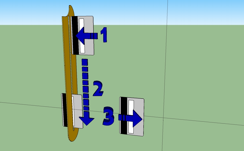
Knowing the approximate diagonal size of the display screen allowed me to scale the photo accordingly and model it true to scale in Sketchup. The whole kiosk was modeled using the photo as the actual CGI models color/texture. Scott showed me an image of a silhouette of a hand swiping a card that was suggested by the kiosk manufacturer to show the nature of the swiping action. I first designed a 1 to 2 to 3 stepped graphic (seen above) using a generic yellow outline for the swiping slot. Yellow was replaced with a similar design used along the length of the kiosk, in the shape of two distinct arrows.
The two separate images were combined and rendered with Twilight in sketchup. So the on-screen graphic resembled the real life as clear as possible, lights, sun shine provided some shading seen through the adjacent window, and the wall texture were also rendered. This was the first version of what I submitted to Scott for approval and his thoughts.
In the meantime awaiting his reply, I drew up a vector image of a hand and card that would leave him open to more than one option as he had been shown and then had shown me of this design.


1 comments:
Post a Comment